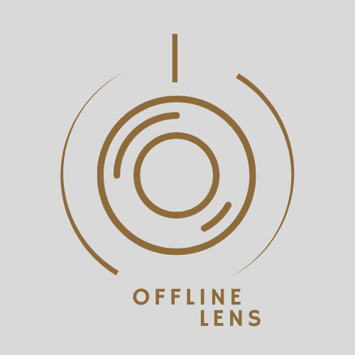
The story behind the logo
and why simplicity matters
Have you ever looked at a logo and thought, “What the heck is this?”
… well, I did. That’s why the OFFLINE LENS logo isn’t just a random design. It’s got a story.
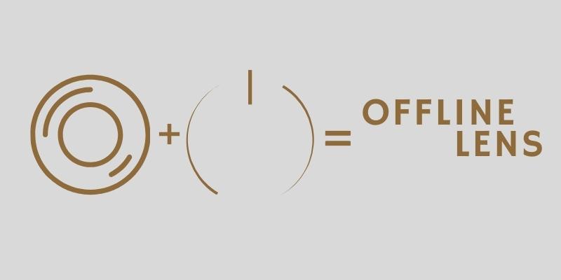
Take a closer look: the logo is a mix of two symbols you know well—a lens (like a camera lens) and the universal “off” button (you’ve seen it on your TV remote a thousand times).
These two shapes explain exactly what OFFLINE LENS stands for: seeing the world clearly (the lens) and unplugging from technology (the off button).
The OFFLINE LENS logo is simple and clean. Why? Because simplicity sticks. It’s the kind of design that makes you go, “Oh, that’s clever!” without needing someone to explain it to you for 10 minutes.
No flashy effects. No extra fluff. Just two shapes that tell a story. And isn’t that what we all need these days?
Less noise, more focus on what really matters.
So next time you see the OFFLINE LENS logo, let it remind you to pause and really look at what’s happening around you.
Maybe it’ll make you laugh at how much time you spend on your phone. Or maybe it’ll make you actually hit that off button.
Because the best moments? They don’t happen on a screen. They happen when you step outside, talk to people, or just enjoy a quiet moment. Just like that.